Typography is more than design; it's communication. For modern SaaS brands, typography isn't just how your text looks—it's how your brand feels. And in a competitive market, your feel is everything. Did you know users form opinions about your brand within 0.05 seconds? Typography plays a huge role in that split-second judgment.
In this guide, I’ll walk you through the most practical, scalable, and brand-building ways to create a typography style guide tailored for SaaS success. Whether you're a startup founder or a brand designer, this article is your go-to manual.
TL;DR
Typography helps define your brand voice and user experience.
Use a consistent font hierarchy and responsive scale.
Your typography style guide should be documented and accessible.
The right fonts build trust; bad ones destroy it.
We cover practical steps, tools, mistakes, and examples for SaaS brands.
Typography Guide for Modern SaaS Brands: Build a Bold, Cohesive Brand Identity in 2025
Typography is more than design; it's communication. For modern SaaS brands, typography isn't just how your text looks—it's how your brand feels. And in a competitive market, your feel is everything. Did you know users form opinions about your brand within 0.05 seconds? Typography plays a huge role in that split-second judgment.
In this guide, I'll walk you through the most practical, scalable, and brand-building ways to create a typography style guide tailored for SaaS success. Whether you're a startup founder or a brand designer, this article is your go-to manual.
Why Typography Matters for SaaS Branding
Typography influences trust, usability, and brand memory. It directly affects your:
- User Experience (UX): Clean fonts improve readability and retention.
- Brand Identity: Fonts convey emotion. Think about Notion's calming minimalism or Slack's playful vibe.
- UI Consistency: Proper typography ensures consistency across product, marketing, and onboarding.
Why is typography important?
Because it connects how you say something with how it's perceived. It balances function with emotion.
Key Components of a Typography Style Guide
Here's what you should include in a strong brand guide typography system:
- Font Families: Choose primary (headings), secondary (body), and accent (highlight) fonts.
- Font Weights: Bold for headings, regular for body, light for captions.
- Text Hierarchy: Define H1 to H6, paragraph, and footnote sizes.
- Line Height & Spacing: Use a modular scale for balance.
- Alignment Rules: Left-align for readability, center for emphasis.
What are typography guidelines?
They are rules and visual standards that define font choices, sizes, weights, and styles used across your brand assets.
Choosing the Right Fonts for Your Brand
Your font should reflect your brand's personality and values. Here are some tips:
- Serif vs. Sans-serif: Serif fonts (like Lora) feel traditional; sans-serif (like Roboto) feel modern.
- Brand Personality: Choose fonts that match your brand's tone—clean and techy for startups, elegant and professional for established brands.
- Top Fonts for SaaS: Inter, Poppins, Lato, Roboto, and Open Sans are popular choices.
- Accessibility Tips: Avoid light weights for body text; always check contrast ratios.
- Typography Licensing: Use Google Fonts or licensed Adobe Fonts to ensure commercial use.
Your font should speak your brand language:
- Serif vs. Sans-serif: Use serif for tradition, sans-serif for modernity.
- Reflecting Brand Personality: Roboto feels clean and techy; Lora feels elegant and professional.
- Top Fonts for SaaS: Inter, Poppins, Lato, Roboto, and Open Sans.
- Accessibility Tips: Avoid light weights for body text; always check contrast.
- Typography Licensing: Use Google Fonts or licensed Adobe Fonts for commercial use.
What is rule #1 in typography?
Legibility comes first. Always prioritize readability before style.
Setting Up Your Brand Guide Typography System
A typography system ensures scalability and cohesion. Here's how to set it up:
- Modular Scale: Use tools like type-scale.com to define font sizes (e.g., 14px, 18px, 24px, 32px).
- Responsive Typography: Use relative units (em/rem) for scalability.
- Use Cases:
UI text (buttons, inputs)
Email newsletters
Marketing materials (ads, landing pages)
Documentation (help center, knowledge base)
Web and mobile layout
- Best Tools:
Figma for design systems
Google Fonts for web-safe typography
Frontify or ZeroHeight for style guide hosting
What is the golden rule of typography?
Consistency is king. Define and follow your rules across all channels.
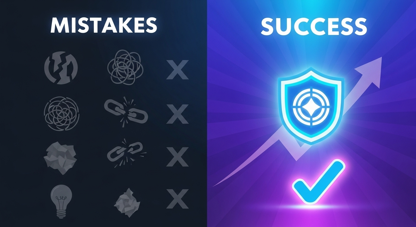
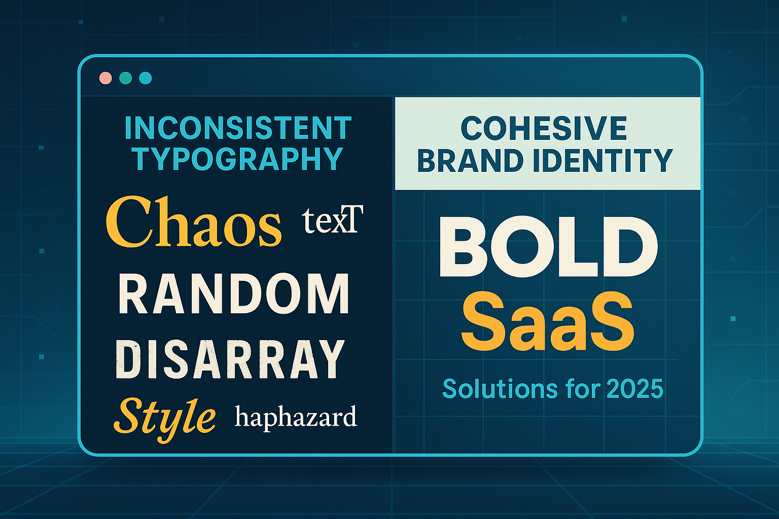
Common Typography Mistakes (and How to Avoid Them)
Avoid these rookie errors:
- Inconsistent Usage: Different fonts on web vs app
- Too Many Fonts: Stick to 2–3 max.
- Unreadable Text: Small sizes, low contrast
- Unclear Documentation: Your team should never guess which font to use
How to Document Typography in Your Brand Guide
Make it easy to access, understand, and use:
- Template Layout:
Fonts with samples and weights
Size hierarchy chart
Color contrast examples
Usage guidelines for each font
Line height, spacing, and alignment rules
- Collaboration Tips:
Keep dev and design teams in sync
Link tokens from your design system
Use shared libraries in Figma or Adobe XD
- Update Protocols:
Version control
Add changelogs for updates
Regular reviews with design and marketing teams
- Tools to Host:
Notion
ZeroHeight
Figma Style Libraries
Frontify
Typography Checklist for SaaS Founders and Designers
Here's your quick audit list:
- Fonts licensed and listed
- Primary and secondary styles defined
- Responsive rules tested
- Accessible color contrast checked
- System documented and shared
- Covers all use cases (web, mobile, email, ads)
What are the 4 rules of typography?
- Use consistent hierarchy.
- Choose web-safe, readable fonts.
- Stick to a limited number of typefaces.
- Prioritize contrast and spacing.
How Can I Teach Myself Typography?
- Read books like "Thinking with Type" by Ellen Lupton
- Follow UI/UX designers on YouTube and X (Twitter)
- Analyze brands like Intercom, Mailchimp, and Stripe
- Use Figma to practice scaling and spacing
- Try online courses on Skillshare or Coursera
Typography Examples from SaaS Brands
Here are some real-world inspirations:
- Notion: Custom typefaces with a minimalist feel
- Slack: Rounded, friendly fonts with fun colors
- Linear: Ultra-modern sans-serif typography
- Mailchimp: Combines classic and modern with playful headers
Typography Styles to Know
- Modern: Clean lines, sans-serif, minimalist
- Geometric: Based on shapes, futuristic (e.g., Montserrat)
- Humanist: More organic, readable (e.g., Open Sans)
- Display: Decorative, for emphasis (not for body)
- Monospaced: Developer-focused, equal-width (e.g., IBM Plex Mono)
Typography Design Tips
- Always test on real screens (mobile, tablet, desktop)
- Use typographic scale to bring balance and rhythm
- Mix fonts wisely—contrast size, weight, and style
- Avoid full-justified alignment for web
A Quick Dive Into the History of Typography
Typography dates back to Gutenberg's movable type in the 1400s. From calligraphy-inspired serifs to pixel-perfect digital fonts, typography has evolved into a design discipline. SaaS brands now favor digital-first fonts that balance clarity, character, and scalability.
Final Thoughts: Your Typography, Your Voice
Typography is your brand's silent ambassador. It shapes perception, builds trust, and enhances user experience. As a SaaS founder or designer, investing in a solid typography system is one of the smartest moves you can make.
At Evietek, I always remind my clients: Your font is your silent ambassador. Typography doesn't just present content—it shapes perception. SaaS users judge your credibility, usability, and professionalism based on it.
Build a typography guide that feels like you. Because your voice matters, even when it's unspoken.
Need help designing a custom brand guide typography system? Feel free to reach out. Let's make your brand talk in the right tone—every pixel of the way.