9 High Converting Website Design Principles for Digital Brands in 2025
Hello there! My name is Dillion Hughes. As a project manager at Evietek and a Brand Specialist with over three years deep in the software industry, I’ve seen a lot. My journey started from scratch, piecing together skills that not only met market demand but also resonated with my own personality. It’s been an incredible ride, and through my blog, I want to share some real, practical insights. My goal is to help you find and build digital skills that genuinely fit, not just follow fleeting trends.
Today, let's talk about something fundamental. Did you know that it takes a user about 50 milliseconds to form an opinion about your website? That is an incredibly small window to make a great first impression! In the dynamic digital landscape of 2025, a pretty website just doesn't cut it anymore. Your site needs to be a conversion powerhouse, a well oiled machine that guides visitors seamlessly from their very first click to a final, satisfying purchase. So, what's the secret sauce? It all boils down to applying fundamental website design principles. This article is your roadmap. We will walk through the nine most critical principles that will make your website look amazing and transform it into a high converting asset for your digital brand. Let's get started!
TL;DR
Guide Their Eyes (Visual Hierarchy): Make your most important element (like "Buy Now") the biggest and boldest thing on the page. Tell users exactly where to look.
Keep It Simple (White Space): Don't cram your pages full of content. More empty space makes your site look professional and helps users focus on what matters.
Be Consistent (Branding): Use the same colors, fonts, and logo everywhere. Consistency builds trust and makes you look professional.
Make It Obvious (Navigation): Don't use confusing or clever names for your pages. A clear, simple menu helps users find what they need in three clicks or less.
Mobile is King (Responsive Design): Your website must work perfectly on a phone. Design for the small screen first, then for the desktop.
Tell Them What to Do (CTAs): Use bright, clear, action-focused buttons like "Get Your Free Trial" instead of a boring "Submit."
Fewer Choices = Faster Action (Hick's Law): Don't overwhelm users with too many options. A limited, focused selection leads to more conversions.
Make Buttons Easy to Tap (Fitt's Law): Ensure your buttons are large and have enough space around them so people (especially on mobile) can click them without errors.
Show, Don't Just Tell (Social Proof): Display customer reviews, testimonials, and trust badges prominently. This proves to new visitors that you're a credible choice.
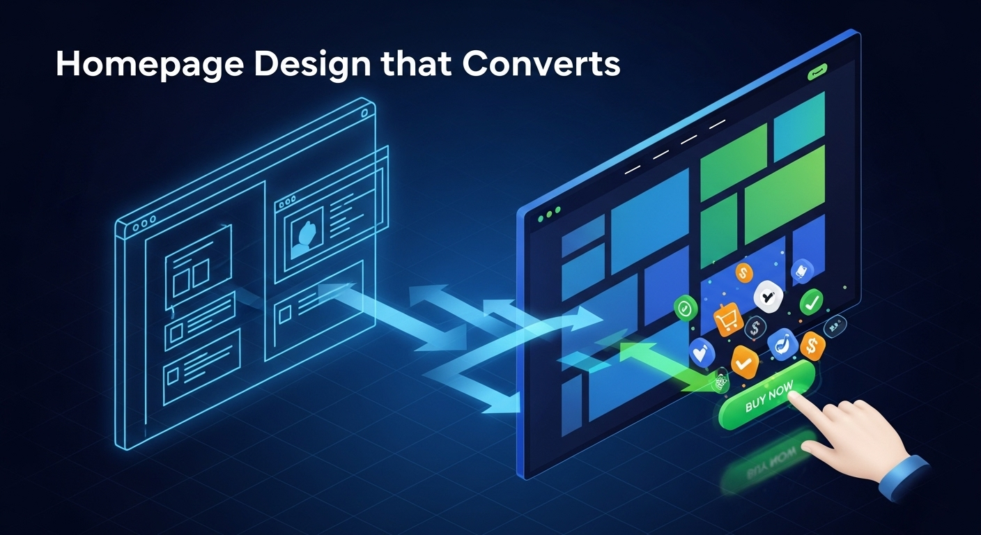
1. Visual Hierarchy: Guiding Your User's Gaze
Visual hierarchy is one of the most critical website design principles because it directs your audience's attention. Think of it as telling a story. You want your users to look at the most important elements first, then the next, in a logical sequence. We achieve this by using visual cues like size, color, and placement. The largest and boldest element on the page, like your main headline, will naturally capture the eye first. This should be your most important message.
Every single page needs a clear focal point. Without one, the user's eye wanders aimlessly, and they quickly become confused or lose interest. What is the one thing you want them to do on that page? Sign up for a newsletter? Click "Buy Now"? That element should be the undeniable star of the show. Strategic use of color can make key buttons pop, while placing important information "above the fold" ensures it's seen without scrolling. Effective visual hierarchy creates a smooth, guided user experience that feels effortless and leads directly to higher user engagement and conversions.
- How to Guide Attention: Use size, color contrast, and strategic placement to draw the eye to crucial elements like headlines and call to action buttons.
- The Power of a Focal Point: Ensure every page has a single, primary point of focus to avoid overwhelming the user and to guide their next step.
- Real World Examples: Look at successful e commerce website design on sites like Apple or Nike. You'll notice their product images are large, headlines are bold, and the "buy" button is distinct and impossible to miss.
2. Simplicity and White Space: Less is More
In a world full of digital noise, simplicity is a breath of fresh air. A clean, uncluttered design is not only aesthetically pleasing; it is also a cornerstone of great website usability. When you present users with too much information at once, they experience cognitive overload. They don't know where to look or what to do next. A minimalist website design approach helps you cut through the clutter and focus on what truly matters.
This is where white space, or negative space, becomes your best friend. White space is the empty area around elements on your page. It's not wasted space; it's an active design element that improves readability and creates a sense of balance and sophistication. Proper use of white space separates blocks of text, making them easier to read. It gives your design room to breathe and helps users focus their attention on the most important content. Ultimately, simplicity and a masterful use of white space lead to a better user experience and, you guessed it, higher conversion rates.
- Embrace Clean Design: A minimalist layout removes distractions, allowing users to focus on your core message and value proposition.
- Leverage White Space: Use negative space strategically to improve readability, reduce clutter, and create a more elegant and professional look.
- Impact on User Experience: Simplicity reduces bounce rates and increases time on site because users can find what they are looking for without frustration.
3. Consistent Branding: Building Trust and Recognition
Your website is often the central hub of your digital brand. It's where potential customers come to learn about you, and consistency here is key to building trust. Consistent branding means using the same color palette, typography, imagery, and tone of voice across every single page of your website. When a user navigates from your homepage to your services page and then to your blog, the experience should feel unified.
This consistency fosters a sense of professionalism and reliability. Imagine if every room in a house had a completely different architectural style. It would feel chaotic and unsettling. The same goes for your website. Inconsistency creates a jarring user experience and can make your brand feel amateurish or untrustworthy. I always advise clients to create a brand style guide. This document outlines your official colors, fonts, logo usage, and more. It becomes the single source of truth for your entire team, ensuring that every piece of content and every new page reinforces your brand identity and builds that crucial recognition with your audience.
- Unified Visuals: Maintain a consistent color scheme, set of fonts, and style of imagery to create a cohesive brand experience.
- The Trust Factor: Brand consistency makes your business appear more professional and reliable, which is essential for building trust with new visitors.
- Create a Style Guide: Develop a formal document that details your brand's visual and tonal guidelines to ensure everyone on your team is aligned.
4. Intuitive Navigation: Making it Easy to Explore
If users can't find what they're looking for, they won't convert. It's that simple. Intuitive navigation is the bedrock of a user friendly website. Your main navigation menu should be simple, logical, and use clear, descriptive labels. Avoid jargon or clever names that might confuse visitors. "Services" is always better than "What We Do." The goal is to make the user's journey through your site as frictionless as possible.
A popular guideline in web design best practices is the "three click rule." This suggests that a user should be able to find any piece of information on your website within three clicks. While not a rigid law, it's a great principle to keep in mind. It forces you to think critically about your site structure and information architecture. A well organized site with user friendly URLs not only helps people find their way around, but it also helps search engines understand your content. This has a direct and positive impact on your SEO best practices and overall website performance.
- Clarity is Key: Design a simple, logical navigation menu with clear and predictable labels that your audience will immediately understand.
- The Three Click Guideline: Structure your website so that users can access important information quickly and with minimal effort.
- Structure for Success: A clear site structure and descriptive URLs are beneficial for both user experience and search engine optimization.
5. Mobile First Responsive Design: A Non Negotiable Principle
In 2025, designing for mobile devices isn't an afterthought; it's the starting point. More people access the internet from their smartphones than from desktops. A mobile first approach means you design the mobile version of your website first and then adapt it for larger screens like tablets and desktops. This forces you to prioritize the most essential content and features, leading to a leaner, more focused user experience on all devices.
Responsive web design is the technology that makes this possible. It allows your website layout to automatically adjust to fit the screen size of any device. This is no longer just a recommendation; it's a requirement. Google itself prioritizes mobile friendly websites in its search rankings. A responsive design ensures a seamless cross device experience. A user can start browsing on their laptop, continue on their phone during their commute, and have the same high quality experience. This consistency is vital for modern digital branding and customer journey mapping.
- Prioritize Mobile: Begin your design process by focusing on the mobile experience to ensure your core content is accessible to the largest audience.
- Technical SEO Impact: Responsive design is a crucial ranking factor for Google and is fundamental to a modern SEO strategy.
- Seamless User Journey: Offer a consistent and optimized experience whether a user is on a phone, tablet, or desktop computer.
6. Compelling Calls to Action (CTAs): Driving User Action
Your Call to Action (CTA) is the most important button on your page. It's the gateway to conversion. An effective CTA is a combination of smart design and persuasive copy. The color should contrast with the rest of the page to make it stand out. Its size should be large enough to be easily tappable on a mobile screen. Its placement should be logical, appearing right after you've made a compelling case for the action you want the user to take.
The copy on the button itself is incredibly important. Use strong, action oriented words. Instead of a passive "Submit," try something more specific and value driven like "Get Your Free Quote" or "Download the Guide Now." Every key page on your site should have a single, clear, primary CTA. Giving users too many choices can lead to indecision. Don't be afraid to A/B test your CTAs. Experiment with different colors, copy, and placements to see what resonates most with your audience. This process of conversion rate optimization can lead to significant improvements in your results.
- Design for Action: Your CTA button must be visually distinct through the strategic use of color, size, and placement.
- One Primary Goal: Focus each key page on a single primary call to action to avoid confusing the user and diluting their focus.
- Test and Optimize: Continuously use A/B testing on your CTAs to find the combination of design and copy that delivers the highest conversion rate.
7. Hick's Law: The Power of Limiting Choices
Have you ever stared at a massive restaurant menu and felt completely paralyzed by the number of options? That's Hick's Law in action. This psychological principle states that the time it takes to make a decision increases with the number and complexity of choices available. In website design, we can apply this law to create a more efficient and less stressful user experience.
When you present a user with too many options in your navigation menu, on a product page, or in a signup form, you increase the cognitive load. This can lead to "analysis paralysis," where the user gets overwhelmed and simply leaves your site instead of making a choice. To improve your website's usability, simplify your navigation menus. Limit the number of form fields to only what is absolutely necessary. On e commerce pages, use filters and categories to help users narrow down their choices, rather than showing them everything at once. By applying Hick's Law, you make it easier for users to make decisions, which directly leads to higher conversions.
- Define Hick's Law: Understand that more choices lead to longer decision times and potential user frustration.
- Reduce Cognitive Load: Simplify navigation menus, forms, and product selections to make the decision making process faster and easier.
- Application Examples: Apply this principle to your main navigation, signup forms, and product filtering systems to guide users toward a decision.
8. Fitt's Law: Making Interactive Elements Easy to Use
Fitt's Law is another psychological principle with powerful applications in user interface (UI/UX) design. It essentially states that the time required to move to a target area (like a button) is a function of the distance to the target and the size of the target. In simpler terms, larger buttons that are closer to the user are easier and faster to click.
This is especially critical for mobile first responsive design, where users are interacting with your site using their thumbs on a small screen. Your buttons, links, and other interactive design elements need to be large enough to be tapped accurately without zooming in. You also need to provide adequate spacing between clickable elements to prevent accidental clicks, which can be a major source of user frustration. When designing your interface, think about the user flow. Place the most common action buttons in easily accessible areas of the screen. Following Fitt's Law is a fundamental aspect of creating an accessible and user friendly website.
- Explain Fitt's Law: The size and proximity of a clickable element directly impact how easy it is to use.
- Design for Touch: Ensure buttons and links are large enough and have enough space around them to be easily tapped on mobile devices.
- Best Practices: Follow established guidelines for target sizes and spacing to create a more usable and less frustrating interface for all users.
9. Social Proof and Trust Signals: Building Credibility
In the digital world, trust is everything. People are naturally skeptical of businesses they've never interacted with before. This is where social proof and trust signals come in. Social proof is the idea that people will conform to the actions of others under the assumption that those actions are reflective of the correct behavior. On a website, this takes many forms.
Testimonials from happy clients, detailed case studies, star ratings, and product reviews are all powerful forms of social proof. User generated content, like customers sharing photos with your product on social media, can also be incredibly persuasive. In addition to social proof, you should strategically place other trust signals throughout your site. These include security badges (especially on checkout pages), partner logos, industry awards, and any certifications you may have. By leveraging these elements, you build credibility and reduce the perceived risk for potential customers, making them feel much more comfortable taking that final step to convert.
- Types of Social Proof: Utilize testimonials, reviews, case studies, and user generated content to show that other people trust and value your brand.
- Strategic Placement of Trust Signals: Display security badges, partner logos, and awards in prominent locations like your homepage, product pages, and checkout process.
- The Psychology of Trust: Understand that social proof works by easing a potential customer's anxieties and demonstrating your brand's credibility and authority.
Conclusion
And there you have it! Those are the nine essential website design principles that will absolutely set your digital brand up for success in 2025 and beyond. This isn't just about making things look good. By focusing on a strong visual hierarchy, embracing simplicity, maintaining consistent branding, and providing intuitive navigation, you create an experience that users genuinely enjoy. When you layer on a mobile first approach, craft compelling CTAs, and apply the psychological power of Hick's Law and Fitt's Law, you begin to see a real, measurable impact on your conversions. Never forget the final, crucial step: building unwavering trust with social proof!
My challenge to you is to take a critical, honest look at your own website. Are you truly applying these principles? If not, don't feel overwhelmed. Start by implementing just one or two of these changes today. You'll be amazed at the difference it can make. It's time to transform your website from a simple digital brochure into your hardest working salesperson and watch your conversion rates soar
Frequently Asked Questions (and Direct Answers)
The core principles of website design are balance, contrast, emphasis, consistency, unity, and hierarchy. These principles work together to create a user experience that is visually appealing, easy to navigate, and effectively communicates its message to the user.
The 8 basic principles of design often refer to visual concepts. They are unity, balance, hierarchy, scale, dominance, similarity, contrast, and space. These elements guide how a user visually interprets and interacts with your website's content.
The 4 C's of website design are a great framework for strategy. They are Content (high quality information), Clarity (easy to understand and navigate), Call to Action (clear next steps), and Credibility (building trust through signals and professionalism).
This likely refers to the six key principles of design: balance, proximity, alignment, repetition, contrast, and white space. Mastering these six concepts is fundamental to creating visually effective and well structured layouts for any website.
The four golden rules, often attributed to designer Jenifer Tidwell, focus on user interface design. They are: place users in control, reduce users' memory load, make the interface consistent, and provide feedback for user actions.
Color theory is crucial in web design as it directly impacts user emotion, brand perception, and usability. A well chosen color palette reinforces your brand identity, while strategic use of contrast (part of color theory) improves readability and draws attention to important elements like CTAs.
The elements of design (like line, shape, color, texture) are the building blocks. The principles of design (like balance, hierarchy, contrast) are the rules that guide how you use those building blocks. A great website masterfully combines both to create a cohesive and effective user experience.
Google's primary guidelines focus on the user. They emphasize creating a mobile friendly, responsive website with fast page load speed. They also recommend a logical site structure, high quality and original content, and implementing technical SEO best practices for accessibility and crawlability.
This encompasses everything we've discussed. It's the synthesis of timeless design principles (hierarchy, balance) with modern best practices like mobile first design, intuitive navigation, clear CTAs, fast loading times, and ensuring your site is accessible to all users.
A great summary of 8 key principles for a good website would be: Simplicity (clarity over clutter), Visual Hierarchy, Intuitive Navigation, Consistency (in branding and layout), Responsiveness (mobile friendly), Accessibility (for all users), Fast Load Times, and Clear Calls to Action.